Saatva Mattress
Redesigning a high-consideration mattress funnel around the questions customers were already asking.
The brief
The product was premium. The path to it was not.
Saatva pioneered direct-to-consumer luxury mattresses and had grown into a $275 million business by 2018. I joined as a UX designer to improve a purchase funnel that was making customers work too hard.
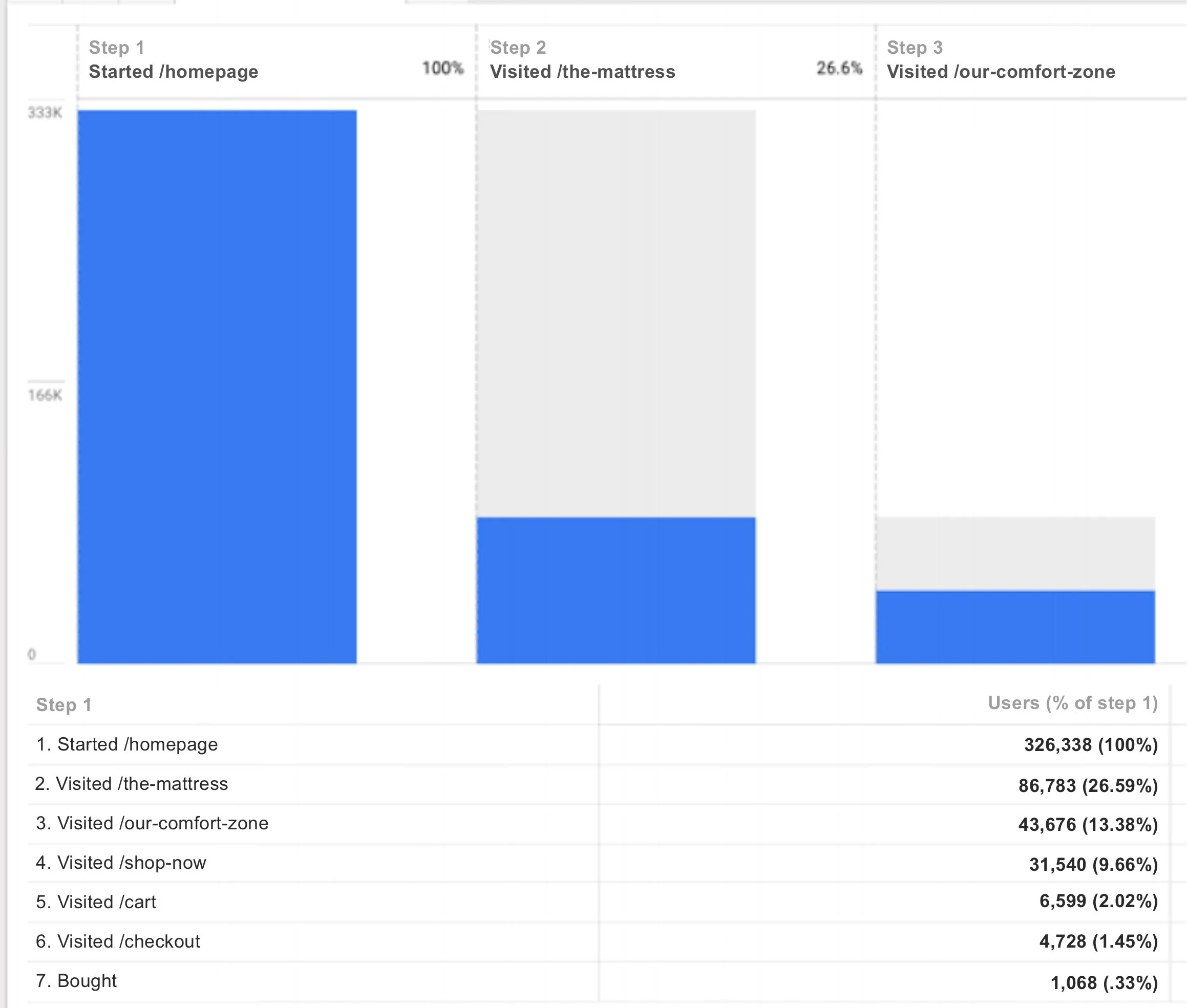
Desktop conversion sat at 0.72 percent and mobile at 0.33 percent. More than 90 percent of visitors dropped before reaching the shop page. The opportunity was to understand where confidence broke down and rebuild the journey around those moments.
01 / Diagnosis
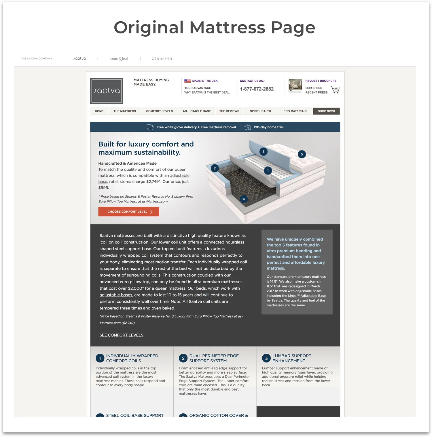
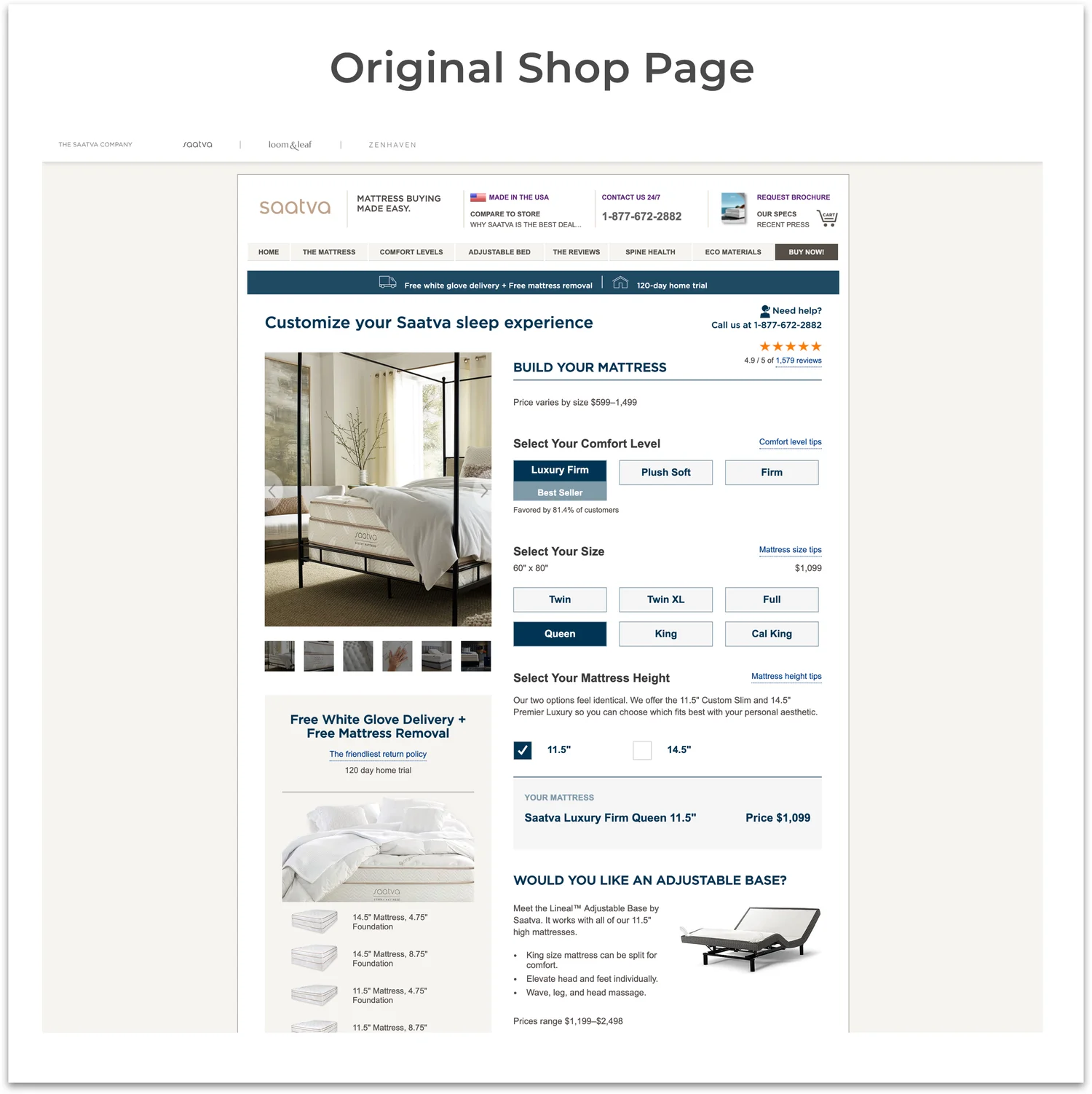
A long funnel hid the product
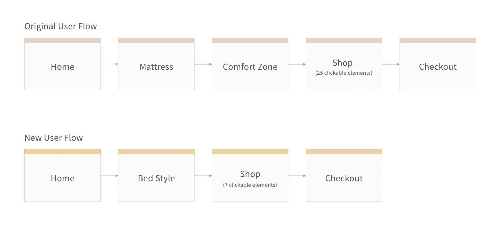
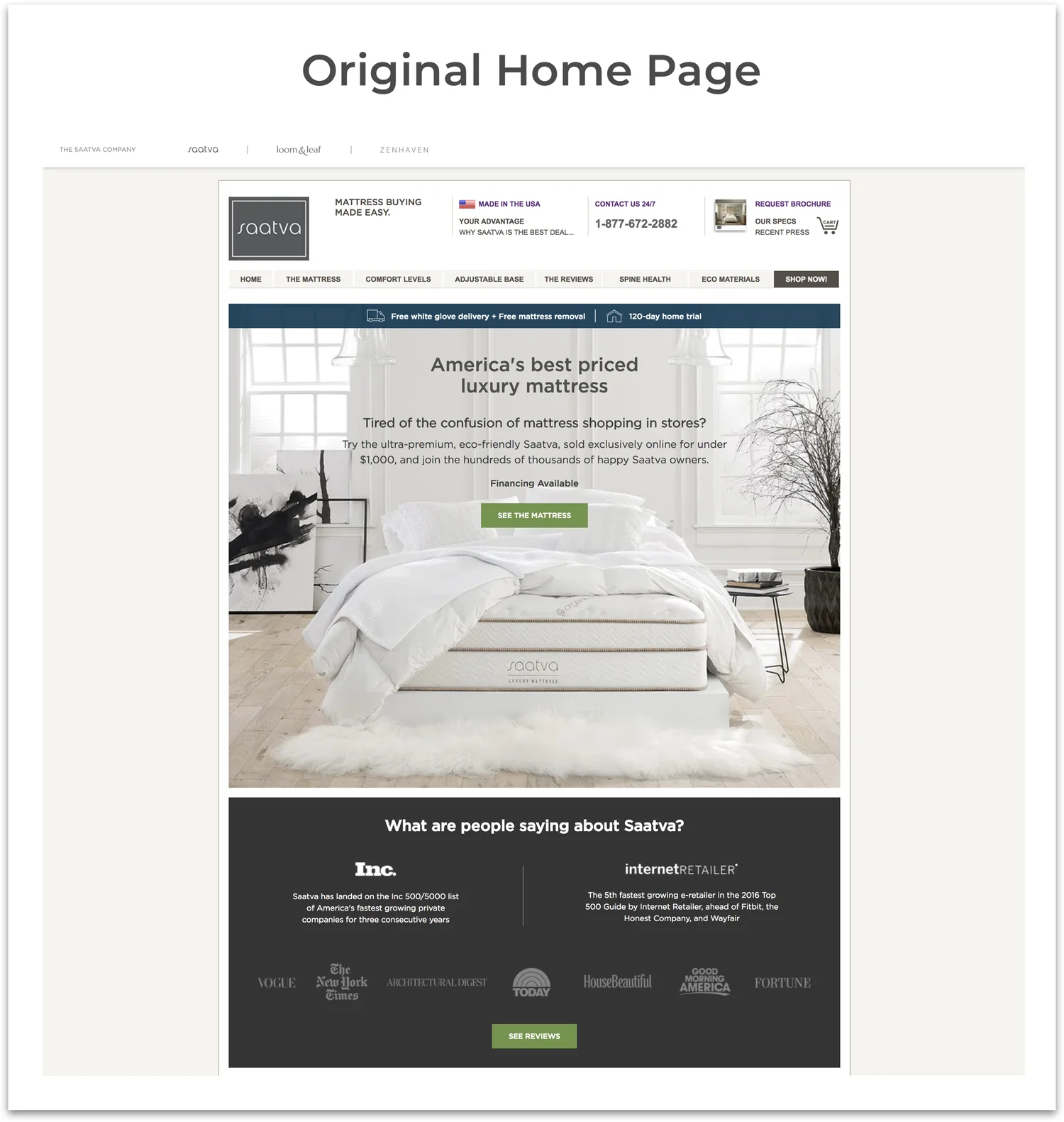
The original experience separated the mattress story, comfort choice and configuration across multiple steps. Before customers could understand the product, they were being asked to decode unfamiliar terms and make setup decisions.
02 / First iteration
Compress the journey, then test the assumptions
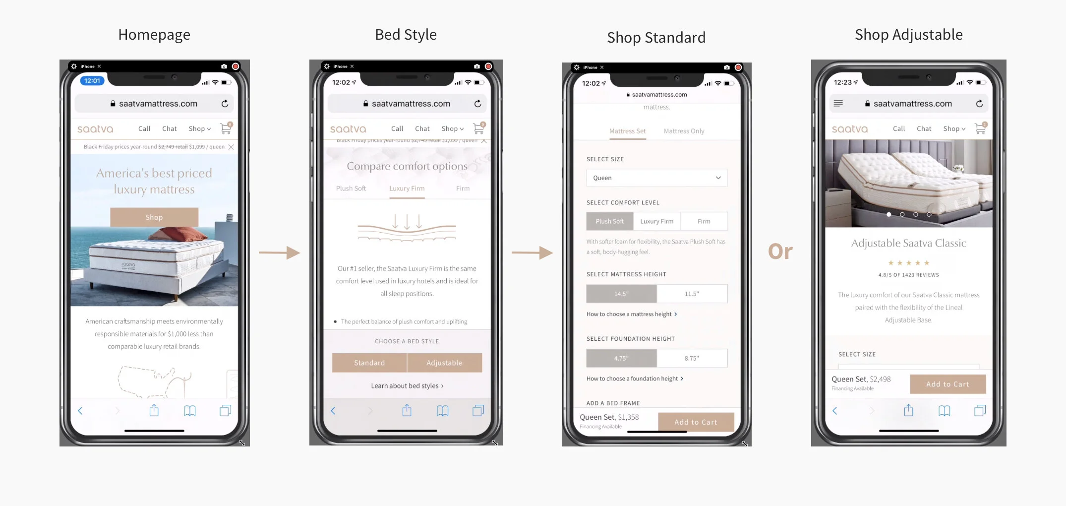
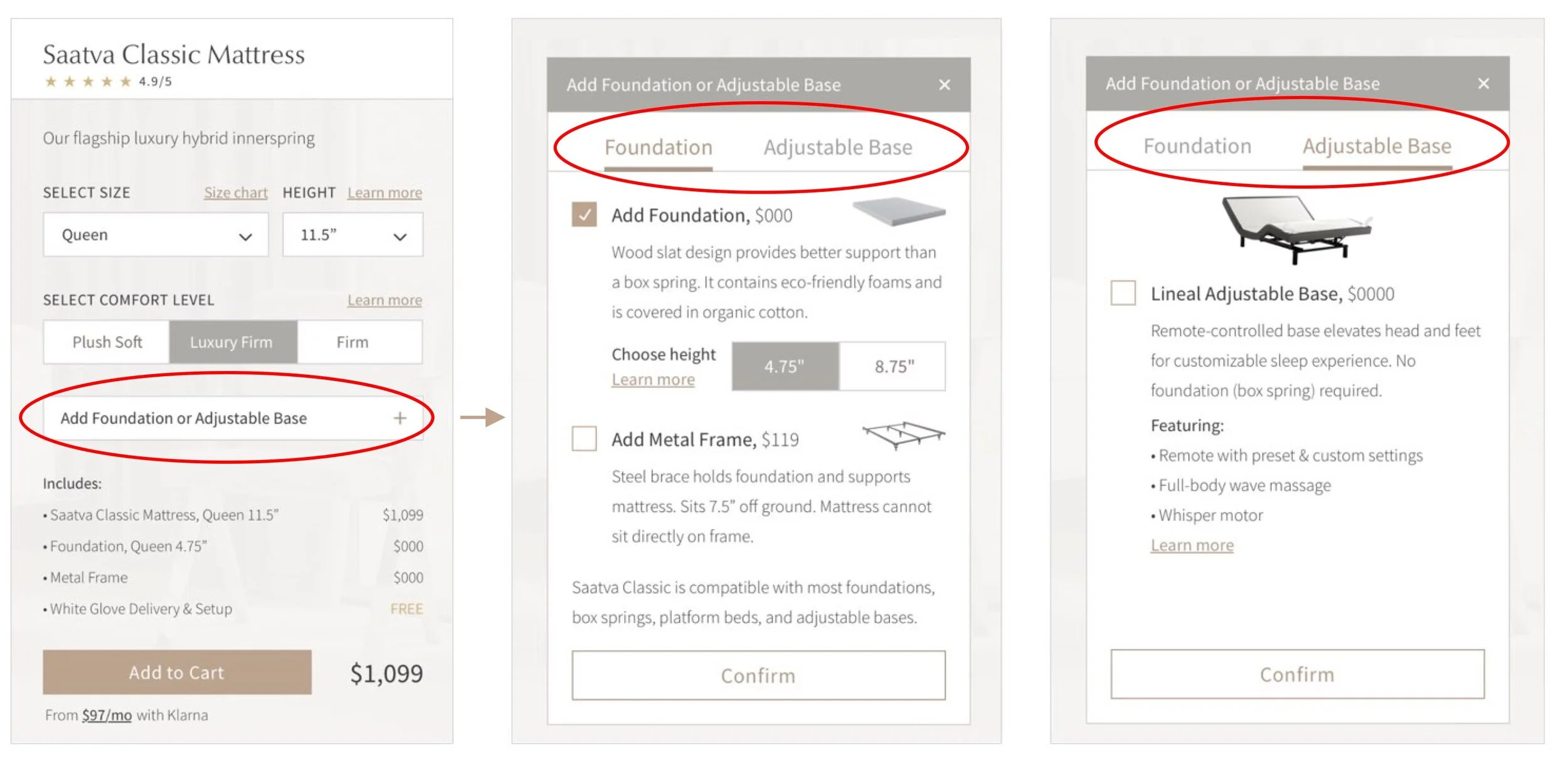
The first concept combined the mattress, comfort choice and shop experience. Configuration moved above the fold and the experience distinguished standard bed setups from adjustable ones.
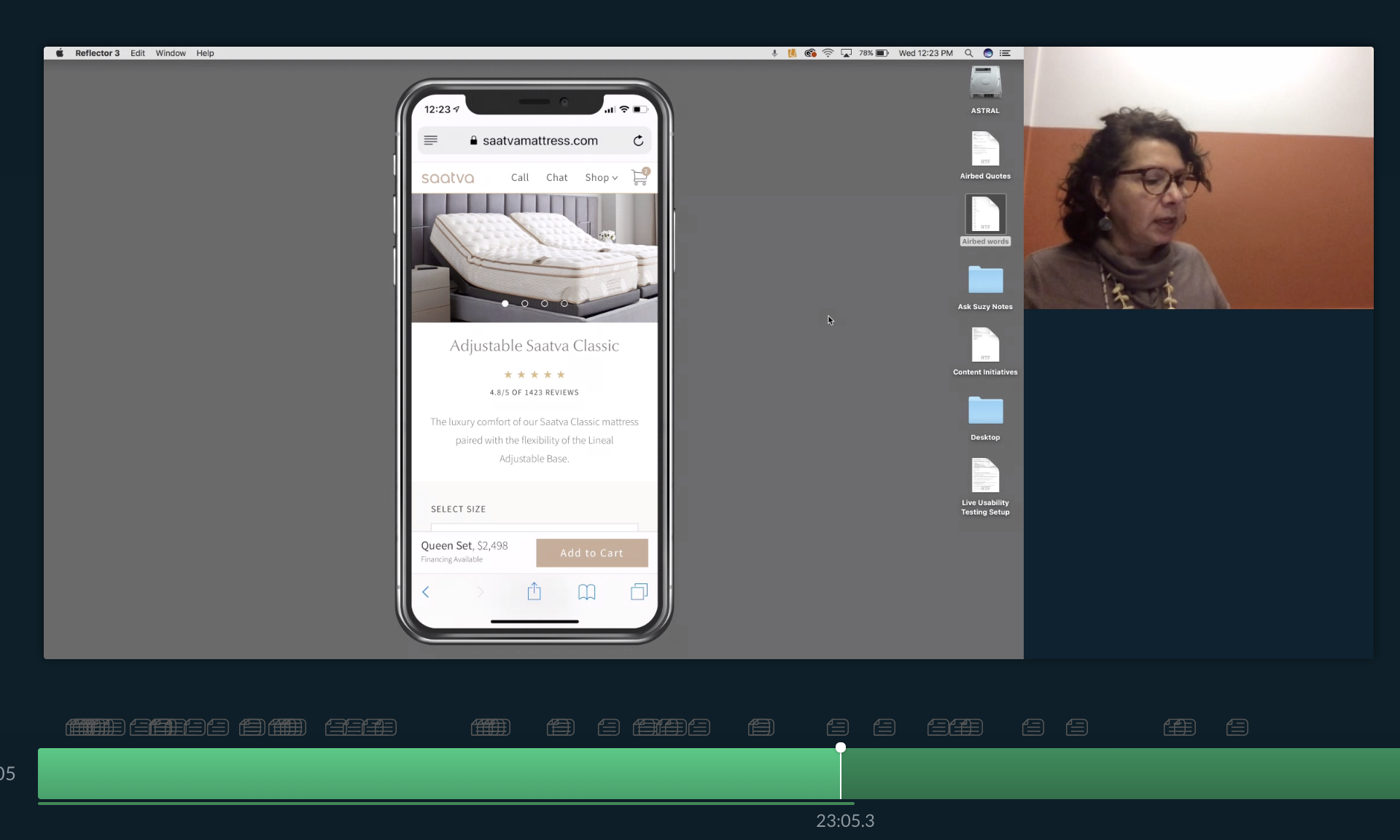
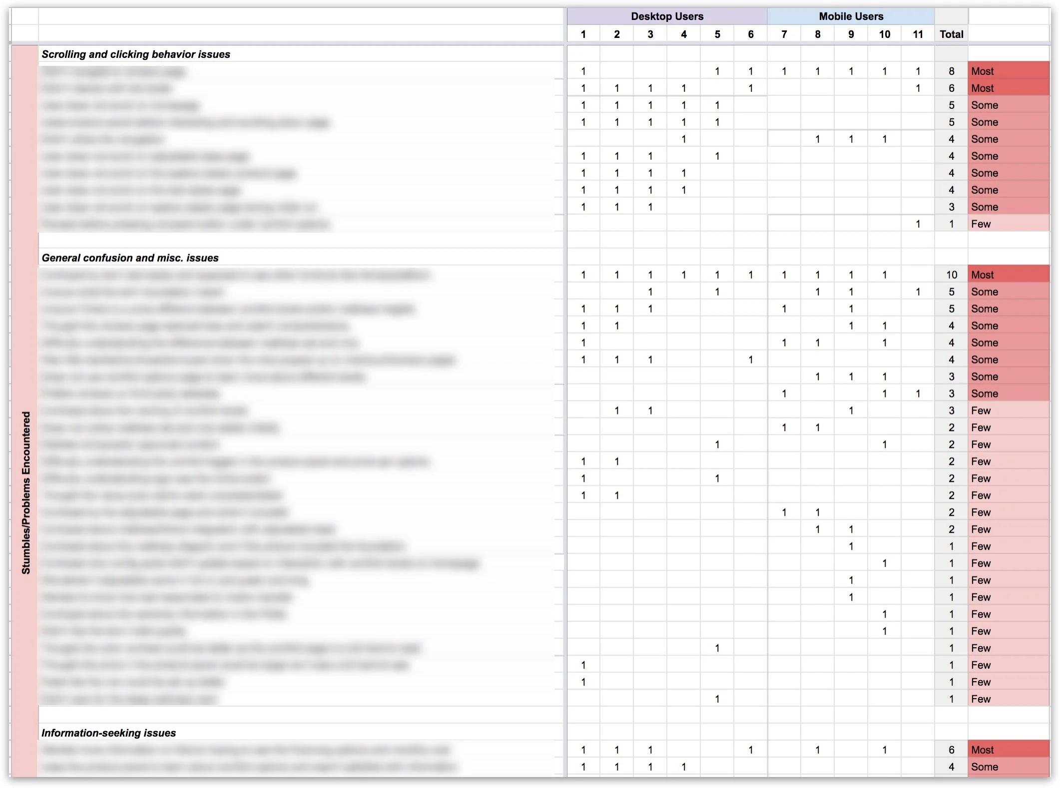
Testing with 11 participants revealed that bed styles, foundations, frames and bases remained confusing. Desktop participants also missed important content below the fold.
03 / Evidence
Listen at scale, not just in sessions
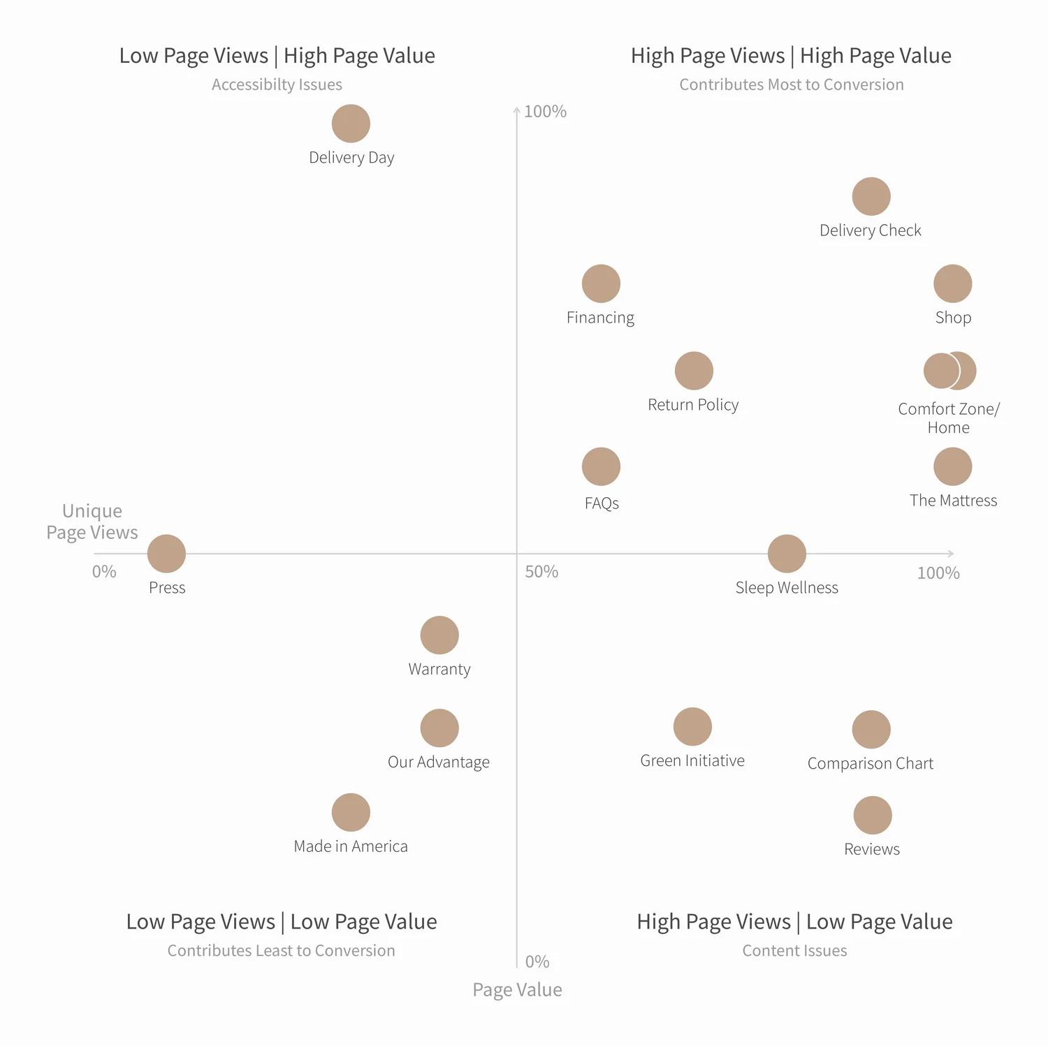
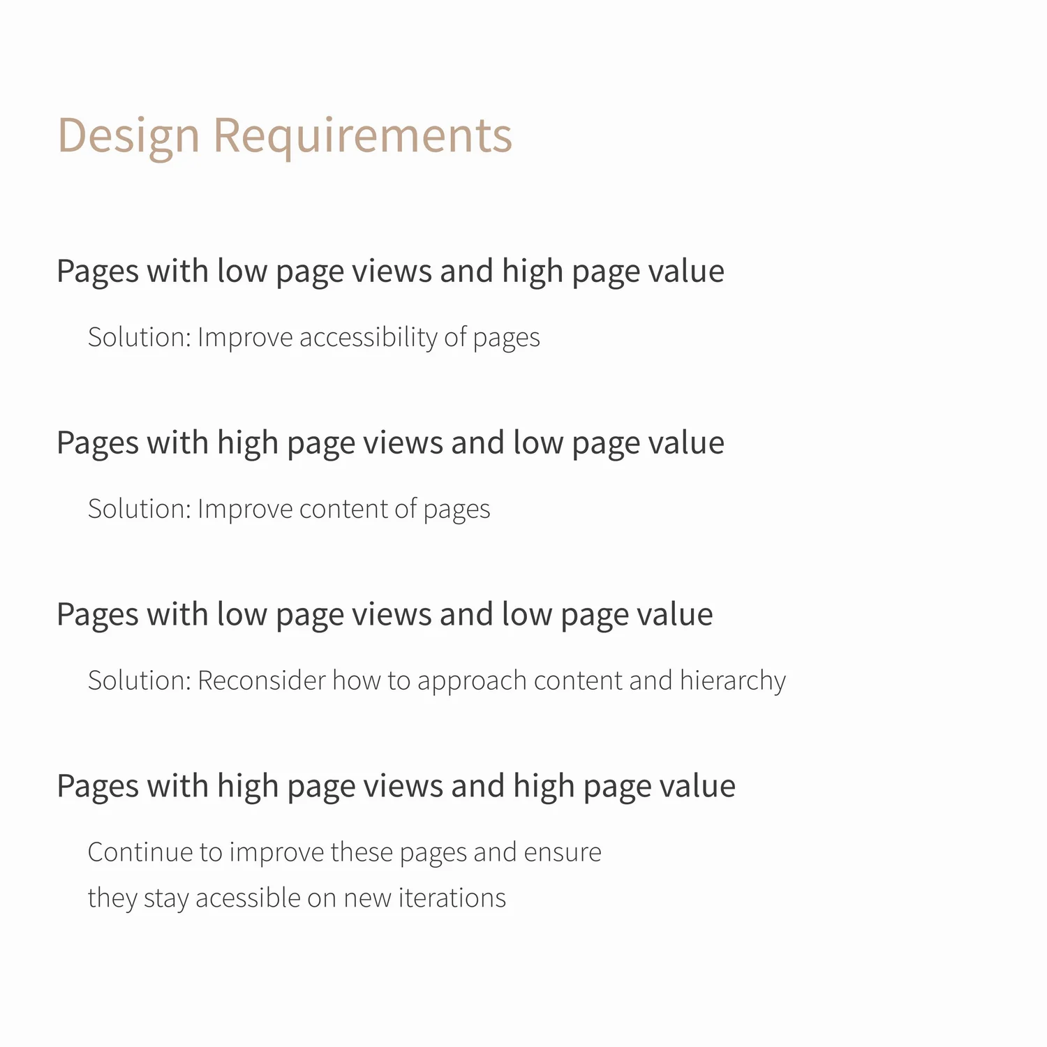
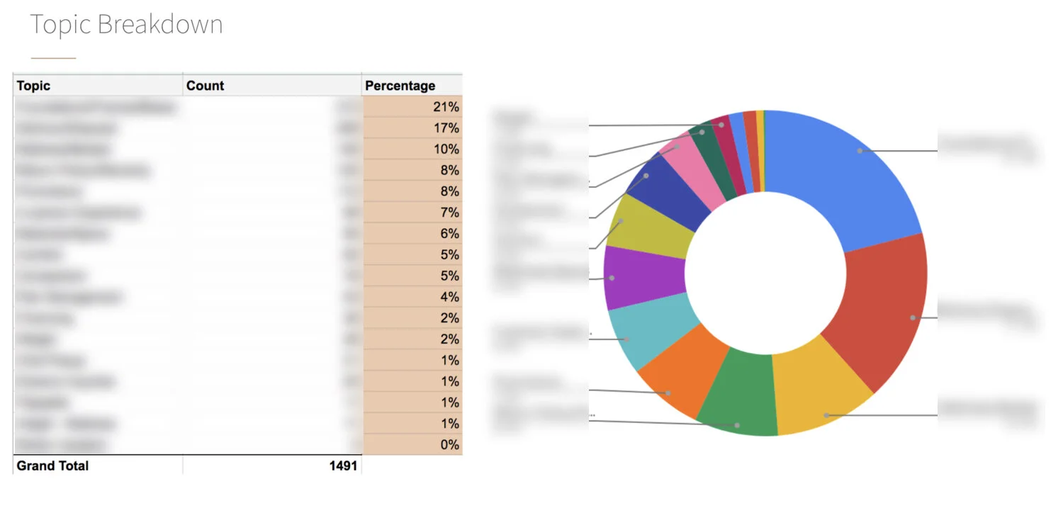
I paired testing with a page-value analysis and a review of 1,500 customer support chats. Twenty-one percent of those conversations showed confusion about foundations, frames and bases.
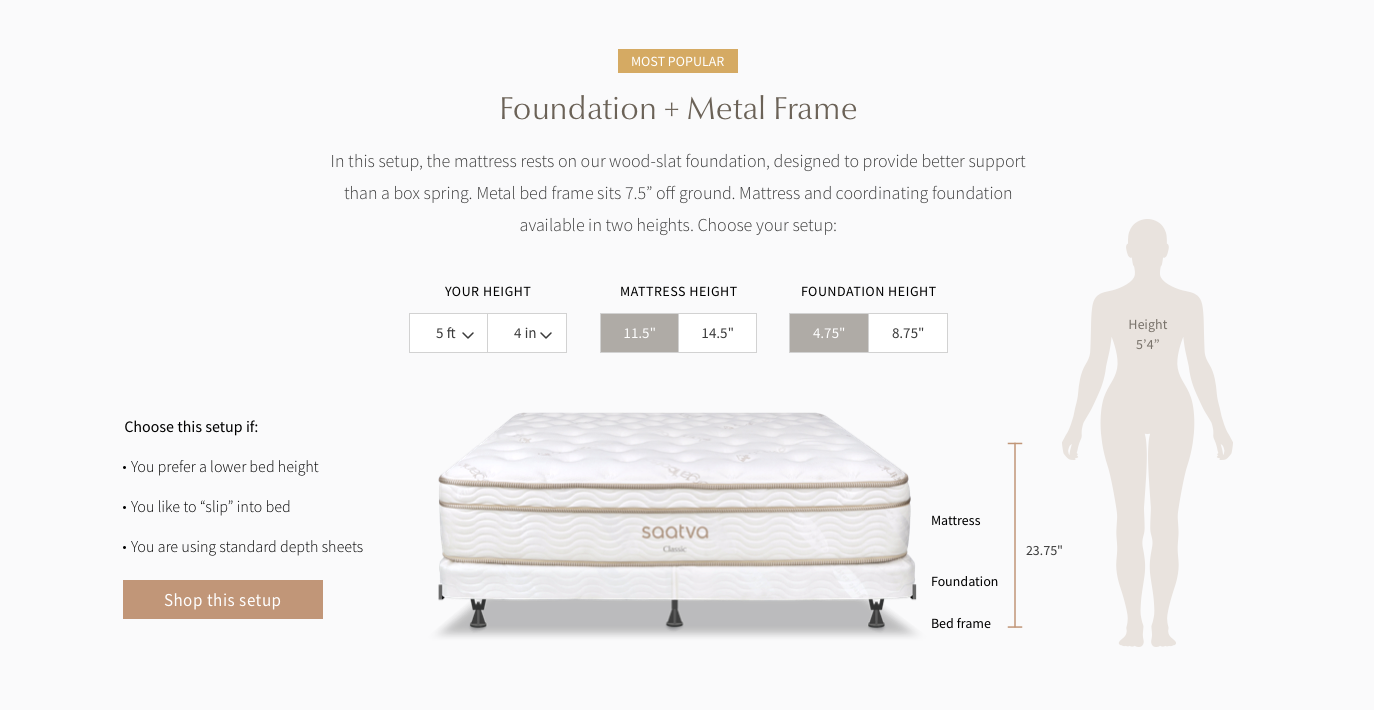
That finding led to a dedicated education page and an interactive height tool that made an abstract setup decision tangible.
04 / New experience
Give the product room to explain itself
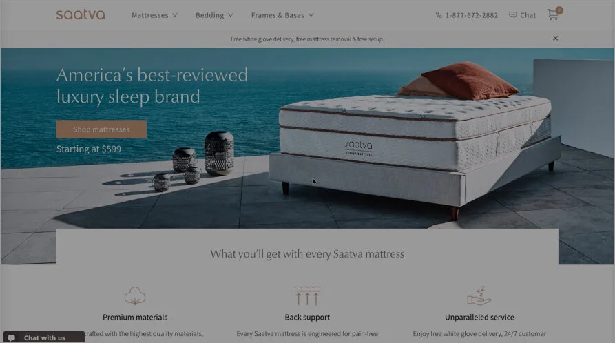
The final direction separated storytelling from configuration in a more intentional way. A dedicated mattress page explained construction, comfort and value. The shop step then reduced foundation selection to a clear tabbed drawer.
Smaller hero media, stronger scroll cues and a simplified information hierarchy kept customers oriented across desktop and mobile.
05 / Results
A clearer route to a premium decision
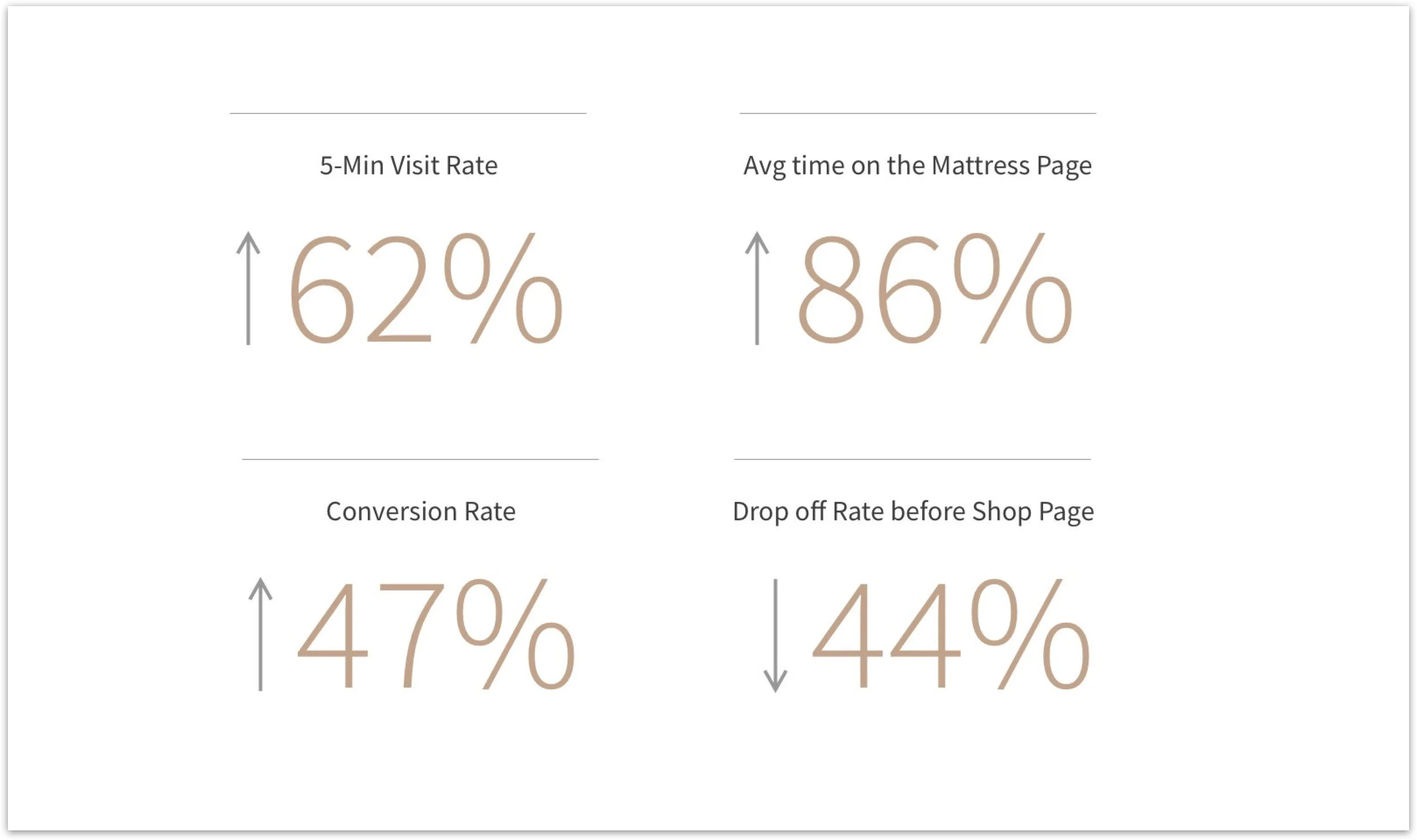
The redesigned flow reduced unnecessary steps, surfaced product education earlier and gave customers a simpler way to configure the bed they actually wanted.