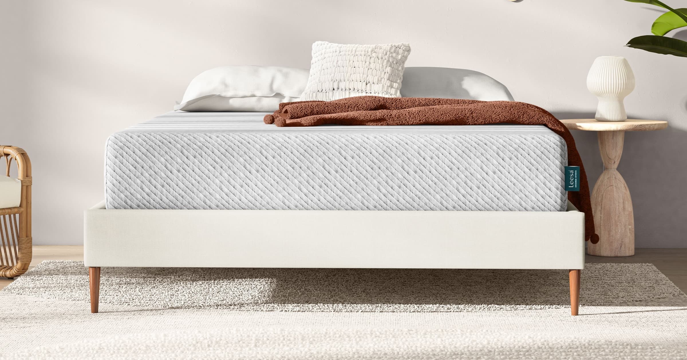
Leesa (Product Design)
Reframing an established sleep brand around clearer decisions, stronger storytelling and a scalable ecommerce system.
The brief
Make a considered purchase feel easier.
I joined Leesa in 2019 to lead a full redesign of its digital storefront. The mandate reached beyond a visual refresh: elevate the brand, remove friction from the buying journey and create a system the team could continue to grow.
The work connected behavioral data, customer conversations, competitive research and iterative testing. That evidence became a new design system and a set of product experiences built around the questions people actually ask when choosing a mattress.
01 / Foundation
A system for a brand in motion
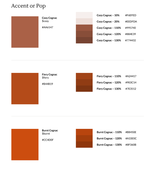
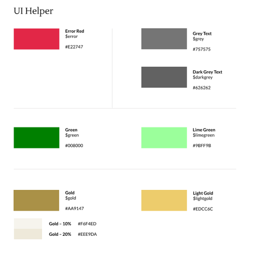
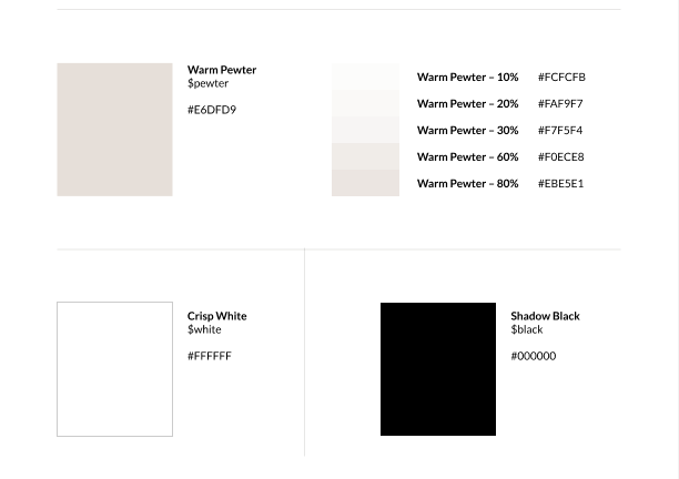
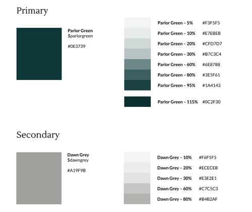
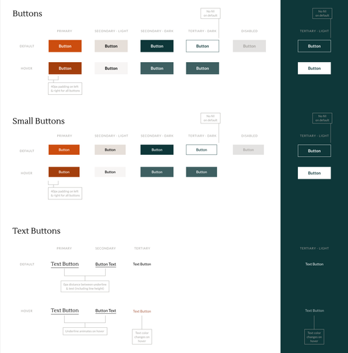
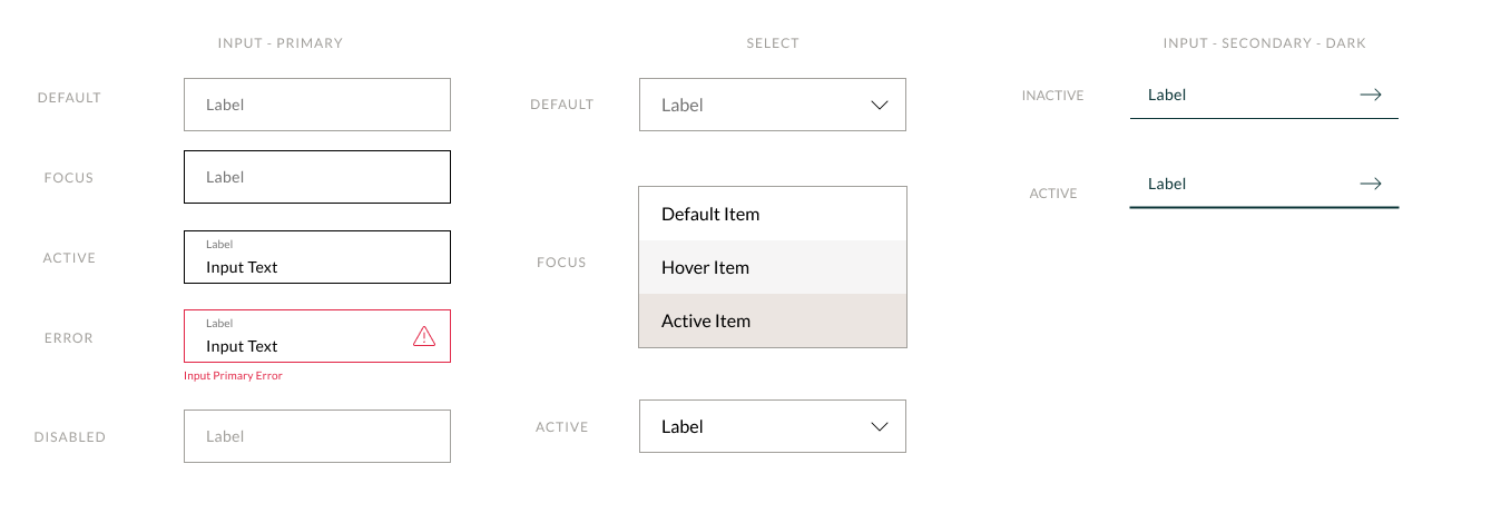
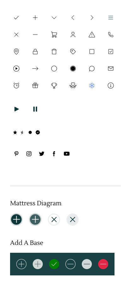
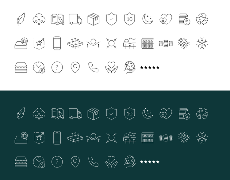
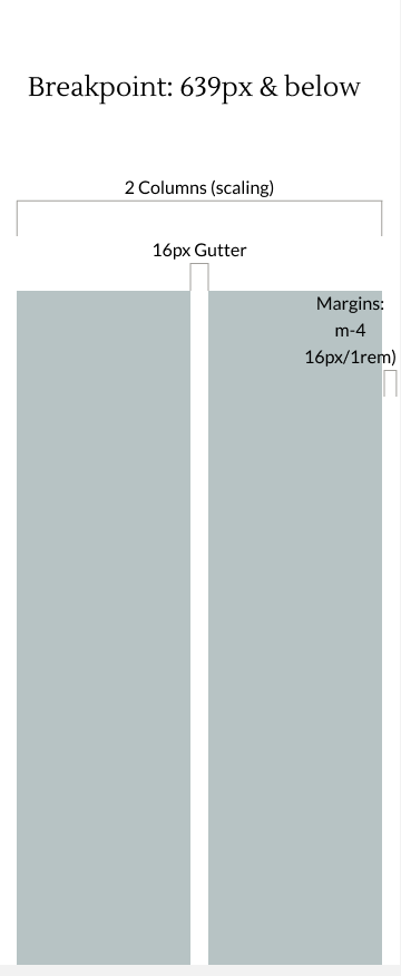
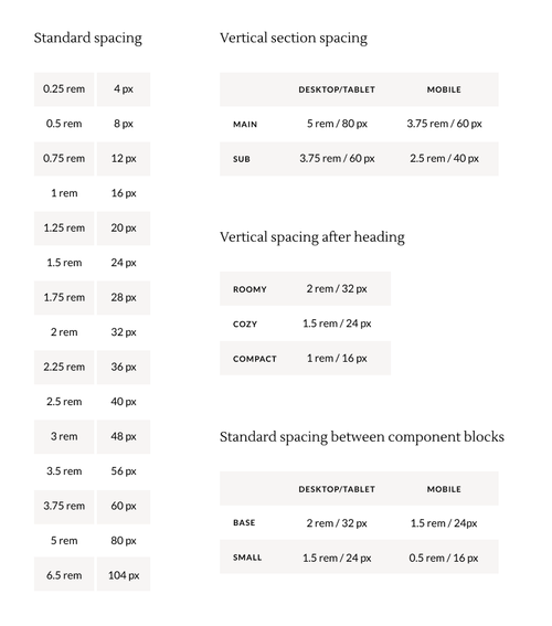
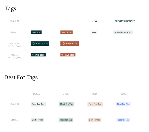
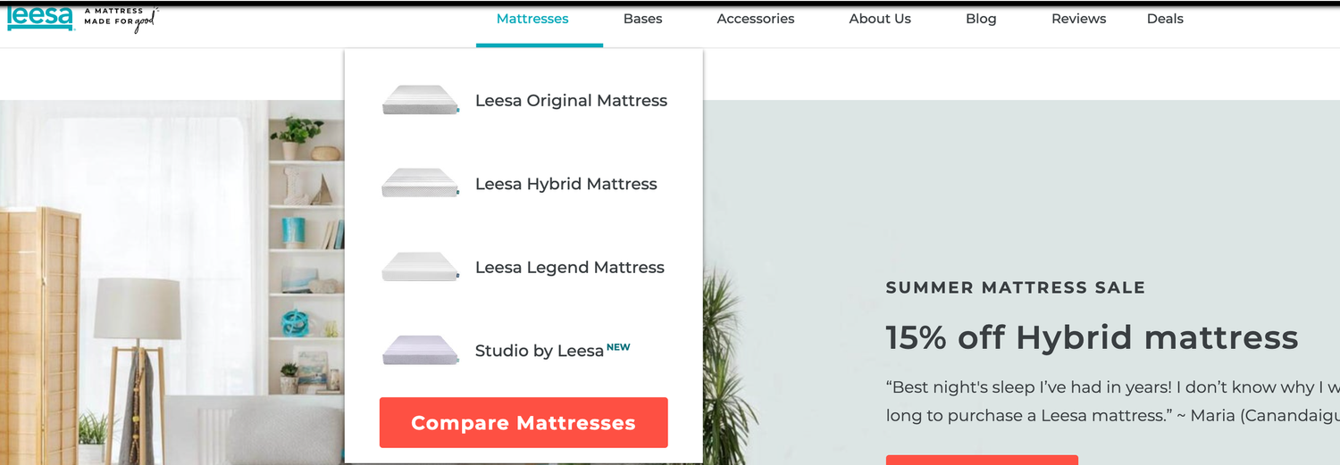
The existing experience had accumulated visual and interaction inconsistencies over time. I created a practical design system that brought the brand palette, typography, grid, iconography, calls to action and reusable components into one shared language.
The system gave design, content and engineering a clearer source of truth while leaving enough flexibility for campaigns, launches and experimentation.
02 / Research
Start with the moments that create doubt
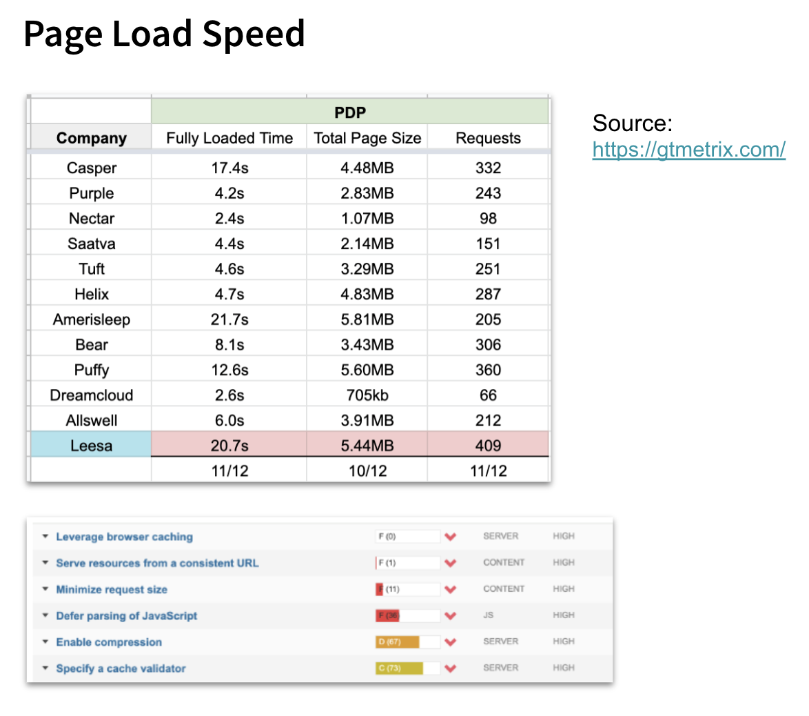
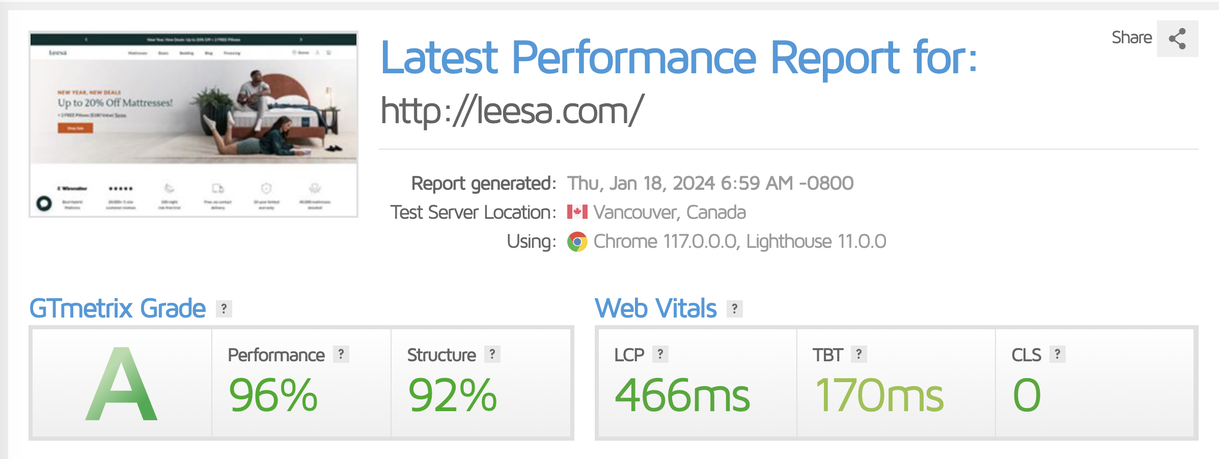
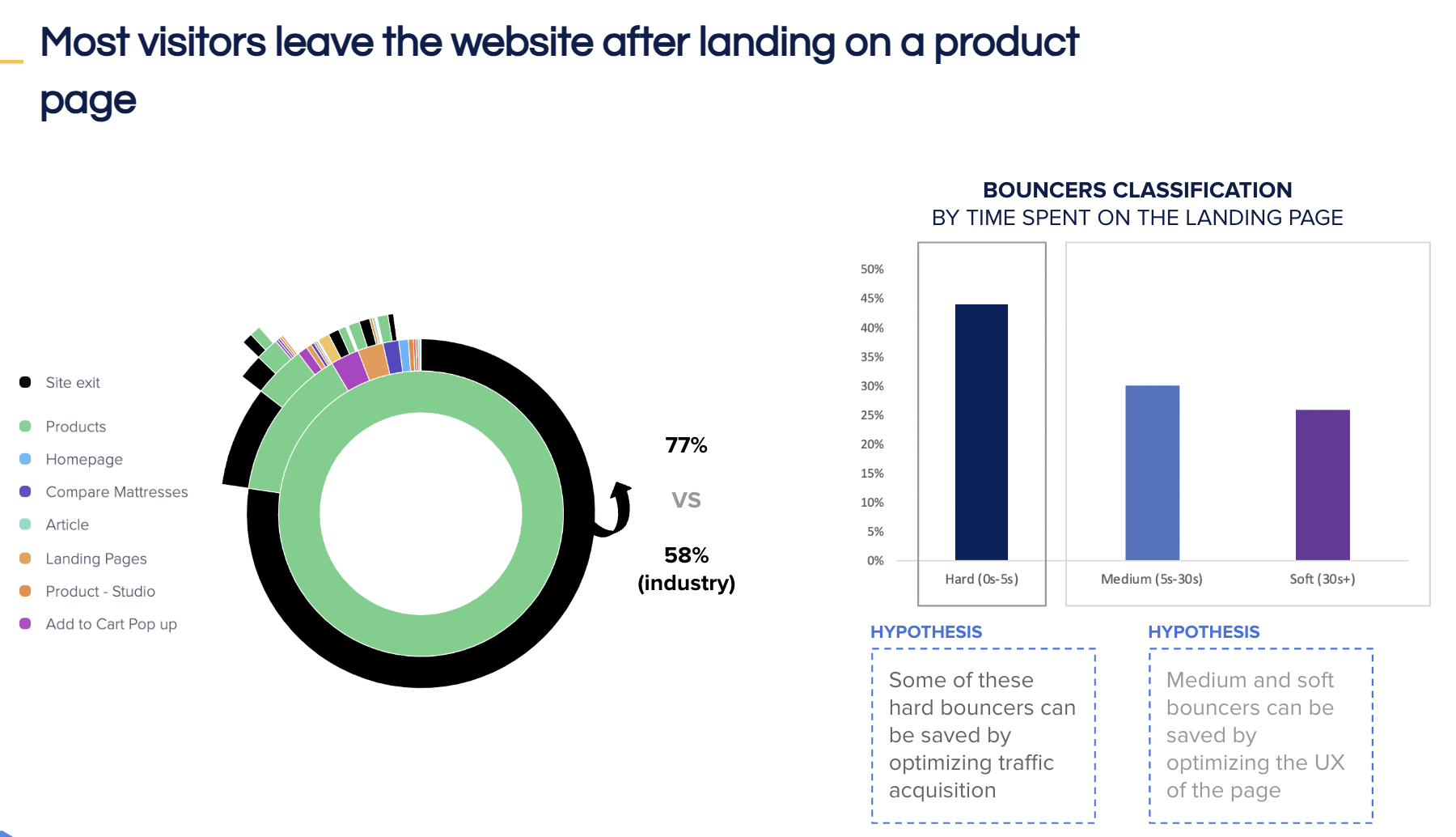
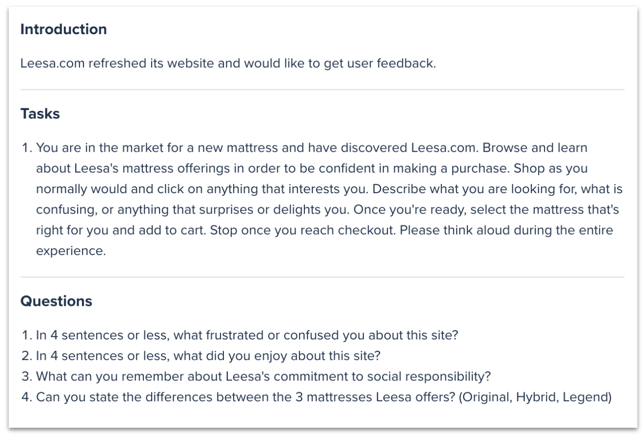
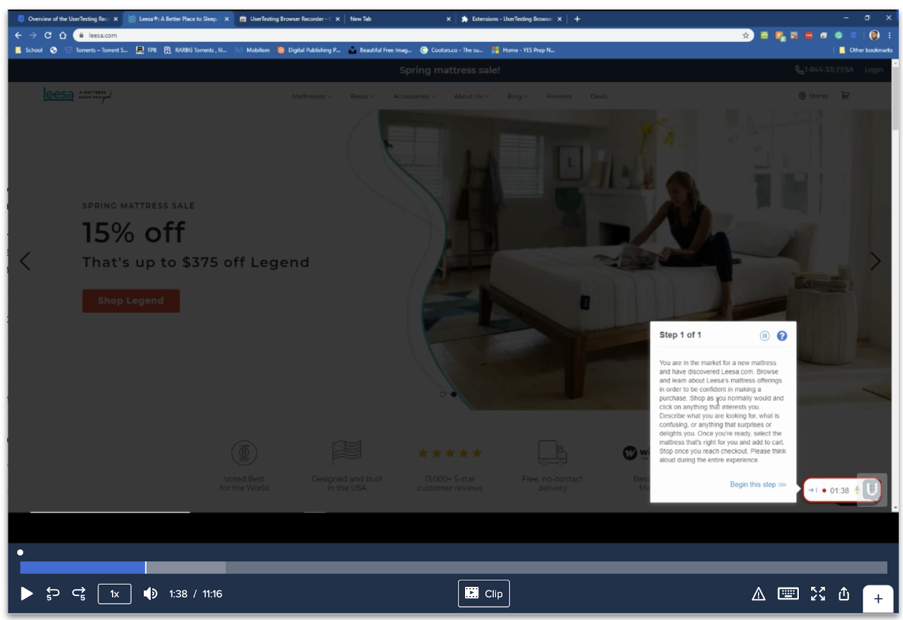
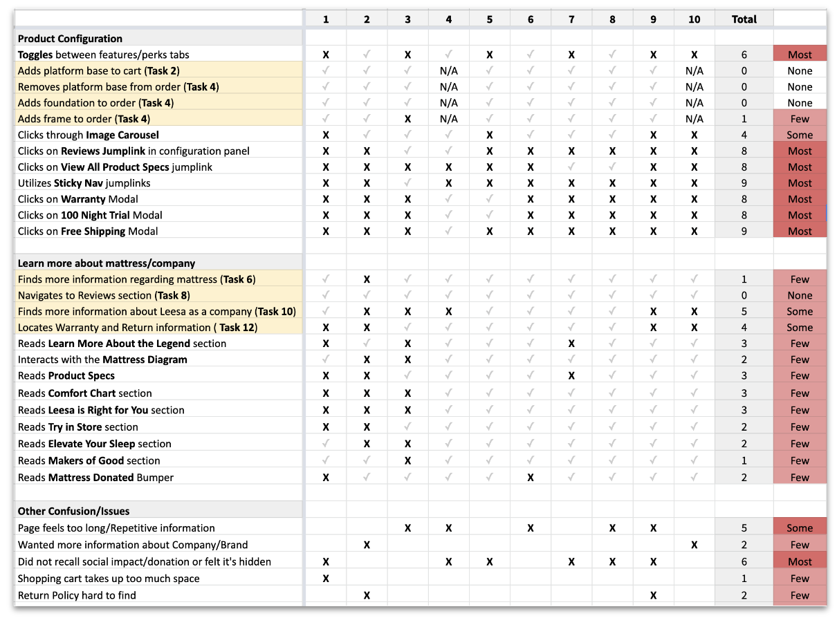
I combined quantitative signals with the language customers used themselves. The research program included analytics, site performance, session behavior, support chat histories, journey mapping, competitive audits and moderated user testing.
- Site data from Google Analytics, DOMO, Contentsquare, Heap and GTmetrix
- Customer chat history and recurring purchase questions
- End-to-end journey analysis across discovery, comparison and checkout
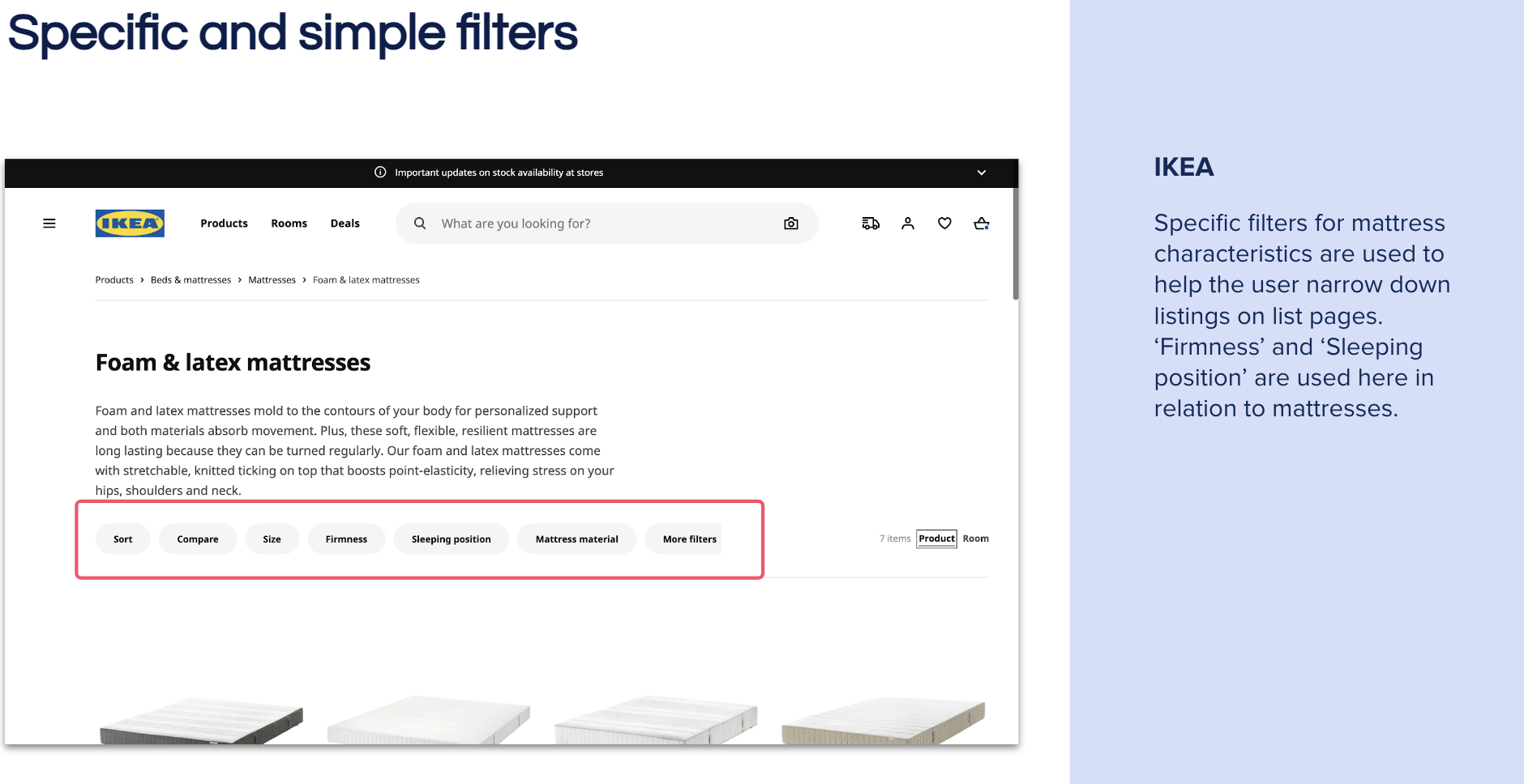
- Competitive audits and moderated usability sessions
03 / Product experience
Turn comparison into confidence
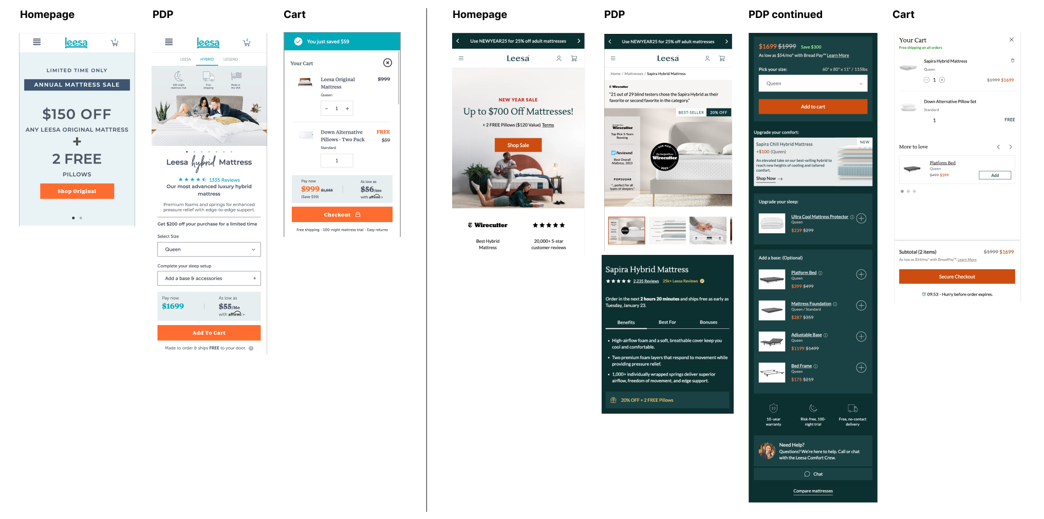
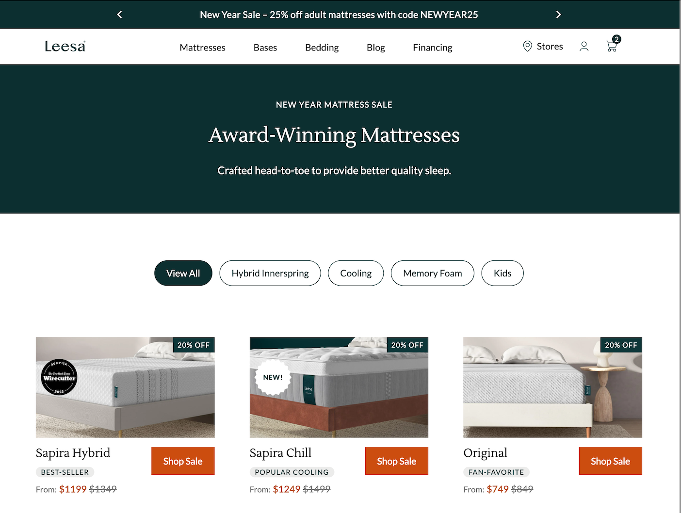
The redesigned product pages made the key tradeoffs visible earlier, paired technical detail with human language and treated reviews, media and financing as part of the decision flow rather than supporting content.
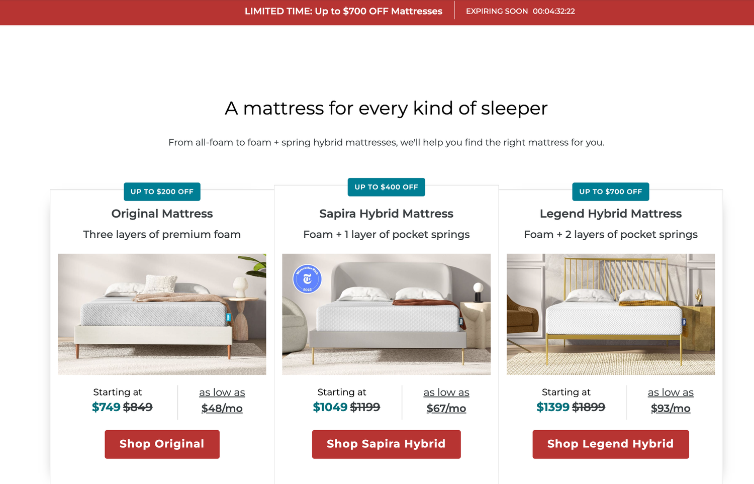
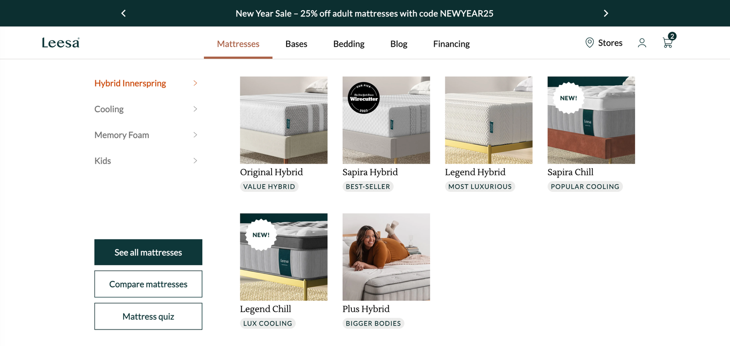
Collections and navigation were rebuilt around comparison. Customers could understand the lineup, narrow the field and move between products without losing context.
04 / Walkthrough
The experience in motion
A full walkthrough shows how the system, content hierarchy and responsive behaviors work together across the shopping journey.
05 / Outcome
A stronger business and a more useful storefront
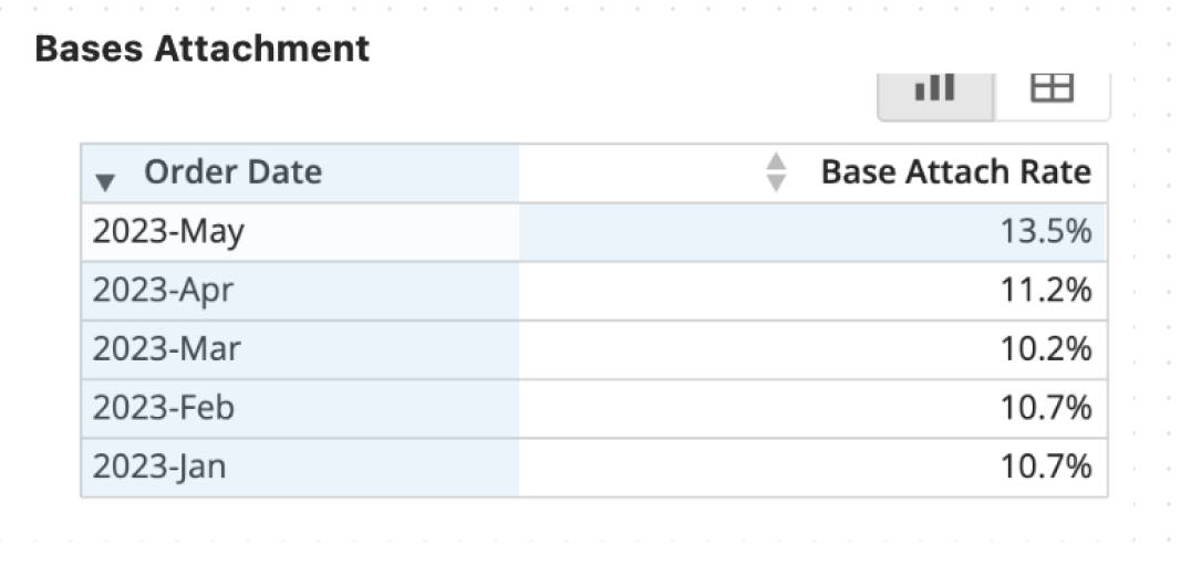
The redesign created a durable foundation for continuous optimization. In 2023, conversion improved 21 percent and average order value increased 14 percent.
The work was also cited by Shopify and Smashing Magazine as an example of best-in-class product page and ecommerce UX practice.